Overview
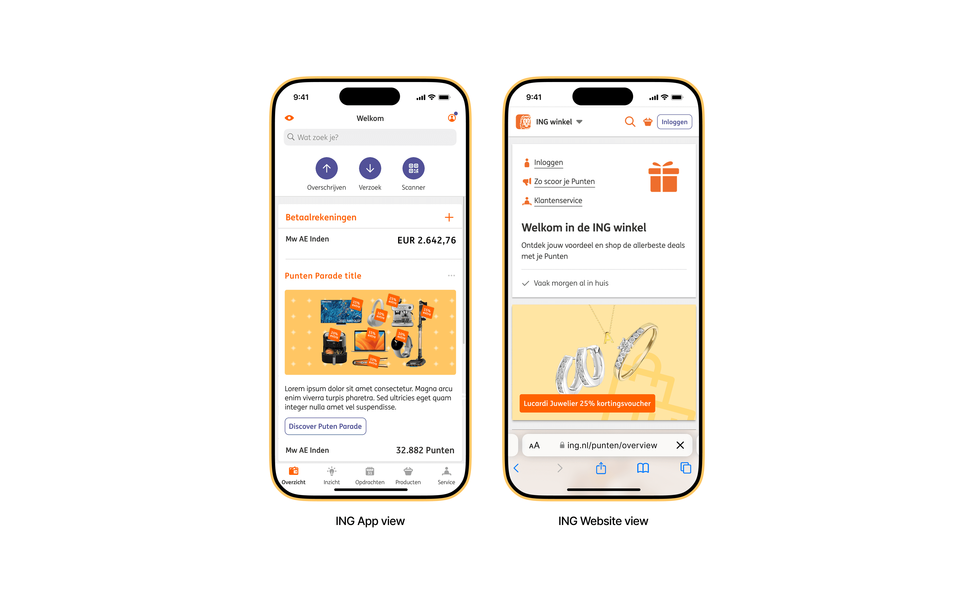
Among the many features ING offers through its digital platforms (app and website) is the ING Winkel (Shop). This feature allows users to accumulate points through their regular banking activities. These points can then be redeemed for a variety of rewards, including discounts on products, experiences, and outings.
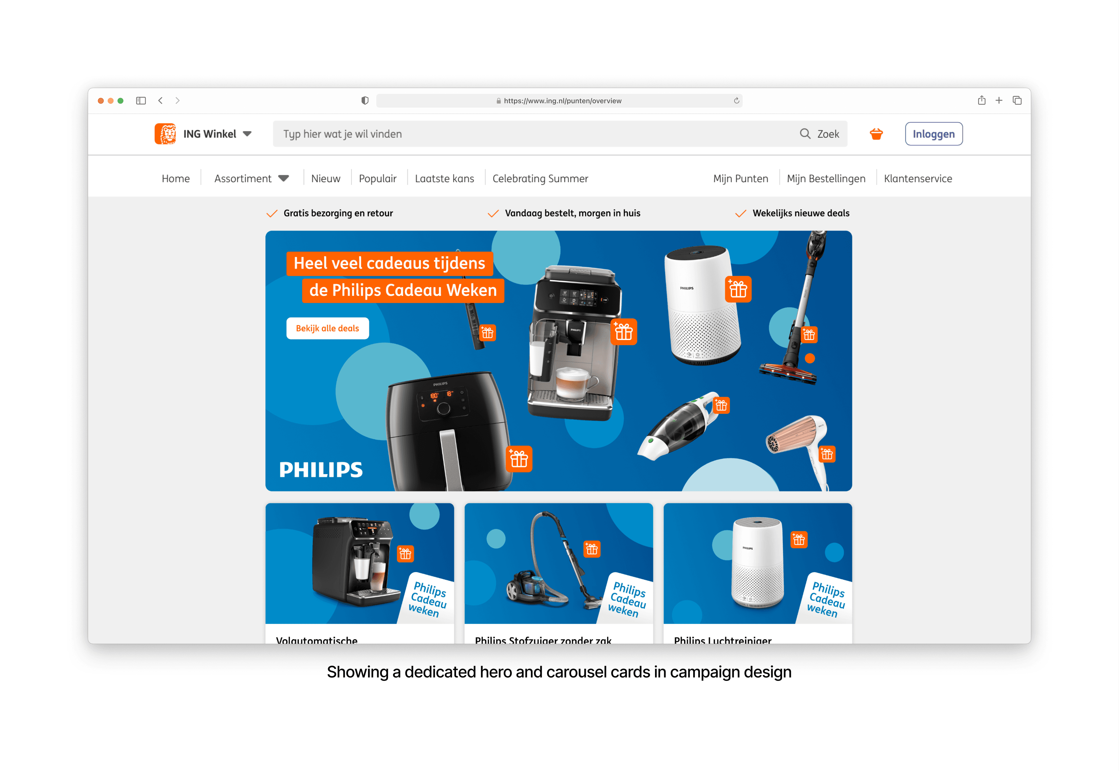
Our objective was to rethink and redesign the ING Shop’s interface to improve user comprehension and navigation, specifically around the various categories where points can be spent. The aim was to deliver a more intuitive and user-centered experience, enabling customers to effortlessly explore and utilise their rewards.
My contribution
Visual Design
Research
Wireframing
Prototyping
The team
1 × Product Manager
1 × Lead Designer
2 × Visual Designers
Year
2024
Short preview
The ING Shop currently faces several design limitations. The interface feels outdated, with some of the components hard-coded by engineers, leading to a lack of flexibility for updates and improvements in the future.
Additionally, product categories are not easily noticeable. Users are required to scroll through the entire catalog just to get a sense of which discounts are available, resulting in a time-consuming browsing experience.
Before diving into the design ideation phase, we conducted thorough competitor research to gather inspiration and identify successful design patterns. Our goal was not only to observe what works well but also to understand why these approaches are effective and how we could apply similar strategies to elevate our own user experience.